Form field properties
Set what a form field is called, how it looks and what it does: name, tooltip, required, read-only, visibility, colours and font, the options of each kind of field, its actions and scripts.
Every field has properties: its name and tooltip, how it looks, and what it accepts or does. Set the most used ones in the Fields panel, and all of them in the field's Properties dialog. Both work in Prepare form: see Create a form.
In the Fields panel
- On the Forms tab, click Prepare form.
- Click the field on the page, or in the list of the Fields panel.
- Change its settings below the list, and click Apply.
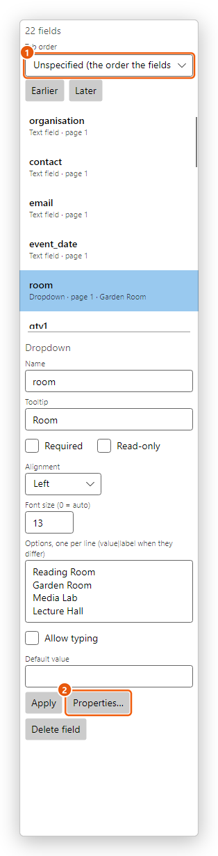
- Tab order: the order of the fields when people press Tab (see Create a form).
- Properties... opens the dialog with all the properties.
The panel shows, for every field, its Name, Tooltip, Required and Read-only, and for:
- a text field: Multi-line, Password, Comb of characters, Maximum characters (0 = no limit), Alignment, Font size (0 = auto) and the Default value;
- a dropdown or list: the items under Options, one per line (value|label when they differ), Alignment and Font size (0 = auto), Allow typing (a dropdown) or Multiple selection (a list), and the Default value;
- a radio group: its Buttons, each with the value it stands for, Add button and the Default value;
- a signature field: what happens When signed (see below).
Apply saves all the changes as one step, that Undo (Ctrl+Z) takes back. Delete field deletes the field, with all its places on the pages.
The Properties dialog
Click Properties... in the Fields panel, or right-click the field on the page and choose Properties.... The dialog has a tab for each group of properties; which tabs there are depends on the kind of field. Make your changes on any of the tabs and click OK: they are saved as one step.
General
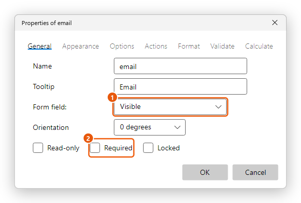
- Name: what scripts, calculations and exported form data call the field. Each field needs a name of its own.
- Tooltip: the tip shown on the field while it is filled in, and what a screen reader says for it. Describe what to fill in, for example Email address. The accessibility check asks for a tooltip on every field.
- Form field (1): Visible, Hidden, Visible but doesn't print (a button that is only for the screen) or Hidden but printable.
- Orientation: turns the field's text by 0, 90, 180 or 270 degrees, for a field on a page printed sideways.
- Read-only: the field shows its value, but people filling the form cannot change it. A calculation or a script can still set it: the amounts and the total of an order are read-only fields.
- Required (2): the form must have a value here. A required field has a red outline when Highlight fields is on, Check Required Fields names it while it is empty, and the form is not sent while it is empty. Buttons and signature fields have no Required.
- Locked: in Prepare form the field cannot be moved, resized or deleted, and its place is kept safe while you work on the others.
Appearance
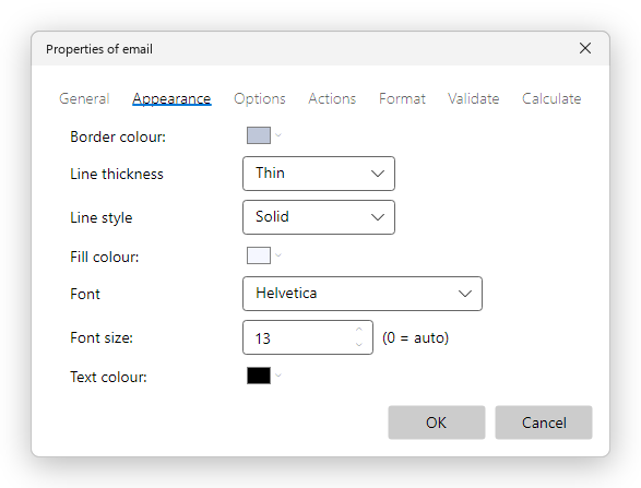
- Border colour and Fill colour: the colours of the field's frame and background. No colour leaves the frame out, or the background clear.
- Line thickness (Thin, Medium or Thick) and Line style: Solid, Dashed, Beveled, Inset or Underline (a line under the field, as on a paper form).
- Font: the font of the text typed in the field. Add font... at the end of the list adds one of the fonts of this computer. Check boxes and option buttons have no font: their mark is a symbol.
- Font size: the size of the text. 0 (auto) sizes the text to fit the field.
- Text colour: the colour of the text, or of a check box's mark.
Options
What the Options tab holds depends on the kind of field.
Text fields
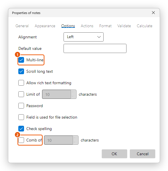
- Alignment: Left, Center or Right. Amounts are easier to read aligned right.
- Default value: the value of an empty form, and what Reset form brings back.
- Multi-line (1): the text wraps, and Enter starts a new line. For addresses and comments.
- Scroll long text: people can type more than the field shows. Clear it to stop the typing when the field is full.
- Allow rich text formatting: marks the field as taking styled text (bold, italic...), as Acrobat does. This editor fills it as plain text.
- Limit of ... characters: the most characters the field takes.
- Password: what is typed shows as dots. The value is still kept in the document: don't use it for real passwords.
- Field is used for file selection: marks the field as one that holds the path of a file, as Acrobat's file-selection fields do.
- Check spelling: marks what is typed in the field for spell checking. Clear it for codes, names and numbers (see also Check spelling).
- Comb of ... characters (2): the field is split into that many equal boxes, one character in each, as for a code or a date written box by box. A comb has one line, and none of the other text options.
Check boxes and option buttons
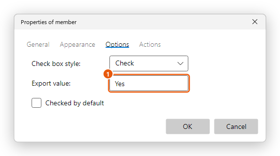
- Check box style: the mark: Check, Circle, Cross, Diamond, Square or Star.
- Export value (1): the value the form keeps when the box is ticked (Yes by default). Calculations and exported data see this value. An empty box's value is Off.
- Checked by default: the box is ticked in an empty form.
- For a radio group, Buttons with the same name and choice are selected in unison: buttons of the group that stand for the same value turn on and off together. The value of each button is set in the Fields panel, under Buttons.
Dropdowns and lists
- Sort items: the items are kept in alphabetical order.
- Allow typing (a dropdown): people can type a value that is not in the list. Check spelling marks what they type for spell checking.
- Multiple selection (a list): people can choose several items: each click chooses an item or takes it back.
- Commit selected value immediately: the value is kept as soon as an item is chosen, rather than when the field is left, for readers that wait until then.
The items themselves are edited in the Fields panel.
Buttons
- Layout: Label only, Icon only, or both: Icon top, label bottom, Label top, icon bottom, Icon left, label right, Label left, icon right or Label over icon.
- Behavior: what the button does while it is pressed: None, Invert (its colours turn), Outline or Push.
- Label and Icon: the text and the picture of the button. Choose a State first: Up is the button as it is; with the Push behavior, the button can also have a label and an icon of its own while it is pressed (Down) and while the pointer is on it (Rollover). Choose icon... takes a picture file; Clear removes it.
- Icon placement: When to scale the icon to the button (Always, Icon is too big, Icon is too small, Never), how (Proportionally or Non-proportionally), Fit to bounds, and where it sits: Space on the left (%) and Space at the bottom (%).
An Image field is a button made for a picture: Icon only, and a click lets the person filling the form choose the picture.
Actions
The Actions tab sets what happens when something is done to the field. Choose the event under Select trigger:
- Mouse Up: the click is released over the field (the usual one for a button).
- Mouse Down: the mouse button is pressed on the field.
- Mouse Enter and Mouse Exit: the pointer comes onto the field or leaves it.
- On Focus and On Blur: the field becomes the one being filled, or stops being it.
Then add the actions it runs, in order: go to a page, open a web link or a file, Reset a form, Submit a form, Show/hide a field, Run a JavaScript and the others. They work as a link's actions: see Links and actions.
For example, a button with Mouse Up and Reset a form clears the form; one with Submit a form sends it to a web address or by email.
Format, Validate and Calculate
Text fields and dropdowns have three more tabs: how the value is shown (a number, an amount, a date...), which values are accepted, and how the value is worked out from other fields. See Calculate, format and check values.
Selection Change
A list has a Selection Change tab: Nothing happens when the selection changes, or This script executes when the selection changes: with the JavaScript to run.
Signature fields
A signature field's Signed tab, and When signed in the Fields panel, set what signing the field does:
- Nothing happens when signed.
- Mark as read-only: the fields that can no longer be changed once the field is signed: All fields, All fields except these or Just these fields, ticked in the list below. Use it so that what was signed stays as it was.
- This script executes when the field is signed: a JavaScript that runs right after the signature.
See Digital signatures to sign the field.
Changing field properties needs Pro, as all of Prepare form does. Without Pro, the Fields panel shows the fields and their settings without changing them.